
Typo posters’ series
Poster design and typography history
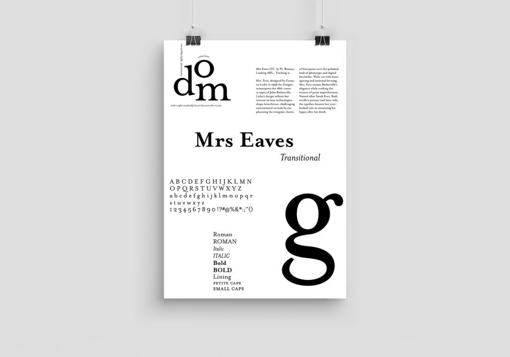
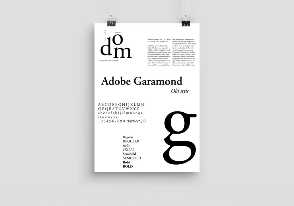
This poster series explores the history and anatomy of three digital revivals of centuries-old typefaces. The design draws viewers in, while also communicating key information about each typefaces.
Each are referencing a landmark in typographic history since Gutenberg’s invention of the movable-type printing press: Old Style, or the French Renaissance Antiqua (16th century); Transitional, or the Baroque Antiqua (17th century); and Modern, or the Didone Antiqua (18th century).
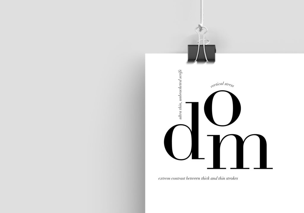
Letters in Focus – Spotlight the most distinctive characters, enlarged and annotated to reveal their unique details.
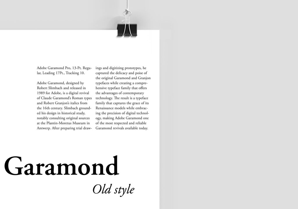
Text in Action – Show the typeface in context with heading, subheading, and body text, bringing its personality to life.
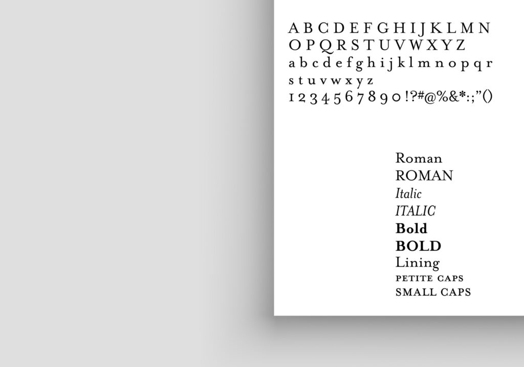
Complete Character Set and Style – Display letters, key glyphs and punctuation, as well as the different font styles, giving viewers a full picture of the typeface’s versatility.
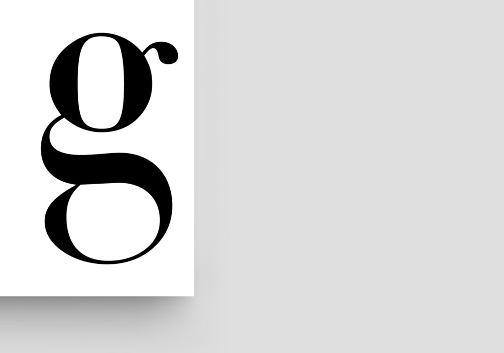
A Letter in Focus – What better way to showcase the beauty of letter anatomy than with the letter “g”?